This time it feels different approaching Assignment three, than for the previous assignment. I feel more prepared and ready to respond to the brief which is to design an illustration for a music event. There is a choice of events and I am choosing “A Jazz evening”. I can recall a brilliant Jazz evening at the Edinburgh Fringe and have occasionally attended local band concerts. There is something special about those emotive brass sounding instruments either in company or as solo. And the range of feelings evoked from mellow to jaunty tap.
In researching for this assignment rather than describing the history and evolution of Jazz music which is very involved I am deciding to look into the work of Scott Joplin and his music. His piano studies were foremost before the new jazz bands became so popular. He was born in poverty in Texas in 1868 just three years after the abolition of slavery in the United States. He was self-taught on the piano to the age of 10 and his skill brought him to the attention of a local music teacher to acquire a musical education. He was able to make a living as a saloon pianist in St Louis in his teens. He played cornet in a brass band and organised a vocal group whilst continuing with studies in harmony and composition. St Louis, a cosmopolitan port on the Mississippi was the birthplace of Ragtime and Scott Joplin was the first with the ability to set down in musical notation the new rhythms and melodies played off-the-beat. His published rag. Maple Leaf swept the country in 1899 and remains the most famous ragtime number. Its success enabled Joplin to retire from public performance and devote himself to composition. He was already established as the leading Ragtime composer and he produced more work over the next 10 years. His later advanced rags experimented both in rhythm and harmony with many strains in minor keys as in Scott Joplin’s New Rag and Magnetic Rag. Joplin also published waltzes and songs.
My next step is to “brain-storm” ideas and connections: Here is the typed spider diagram:-

Through brain storming Jazz has been explored in terms of music, composition, improvisation, instruments, entertainment, stage, dance, attire, style.
In gathering material for a mood board I then look through music magazines (both classical & rock), visit the local stores and find a sparkly gift bag that reflects both the magic of an evening and the sparkly jazz, some ribbon fabrics, glass bracelet add a sense of class and a doily gives space for a dance floor:-
Here is a photograph of the mood board:-
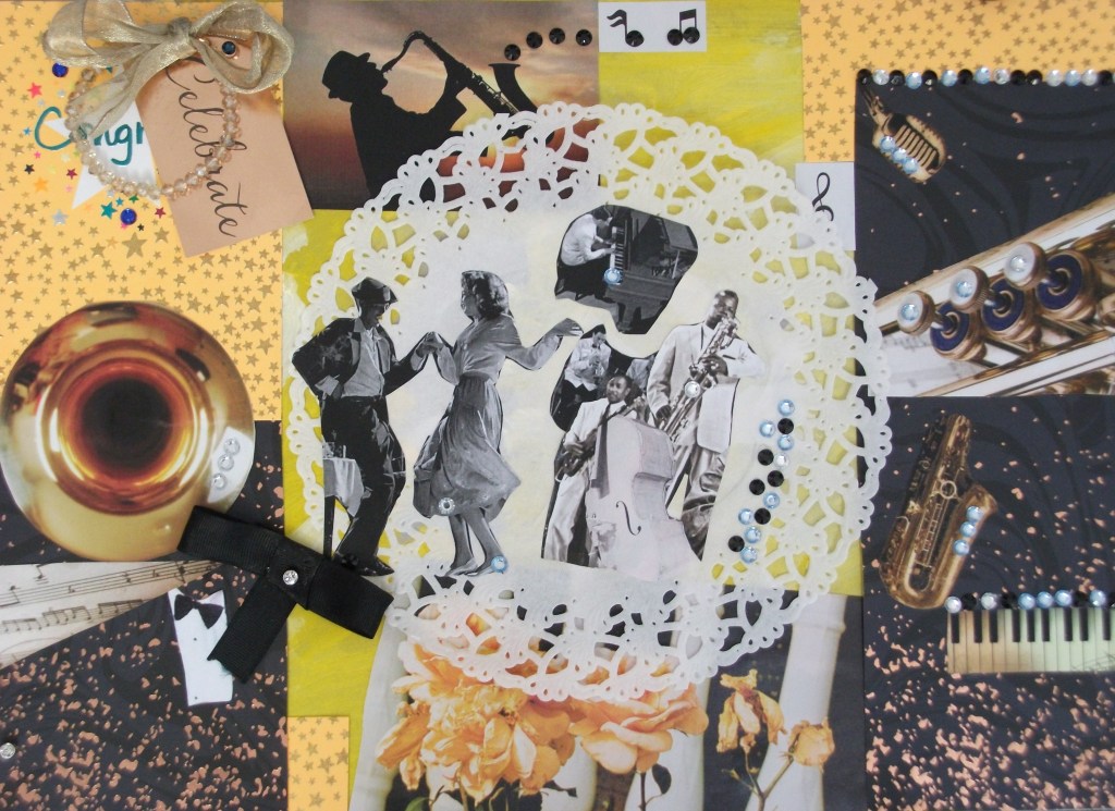
While it is a fun and lively mood board and does include some collage in the centre with the musicians, I have been selective in capturing the evening theme of Jazz music, dance and celebration. A few instruments can be seen – piano/keyboard, Trumpet, cello, silhouette saxophone. The bow tie and ribbon give the sense of smart dress.
There are sparkle trimmings dotted around the board to shine and add to the magic of the evening. When I look back to the mood boards completed for assignment two (which are busy collage) I can see improvement in having a better understanding of working through choices of material to communicate the sense of a theme.
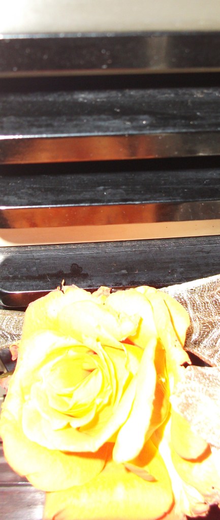
I particularly like the picture I found in a magazine of the yellow roses against the struts of a fence/chair (which you can see in the lower part of the mood board). I find a similar rose and place it on a chair to see if I can incorporate it into a poster in a similar fashion:-
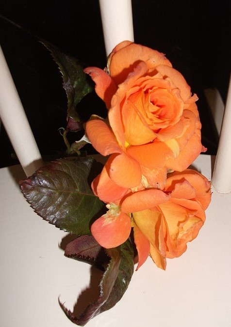
And then at another angle:-
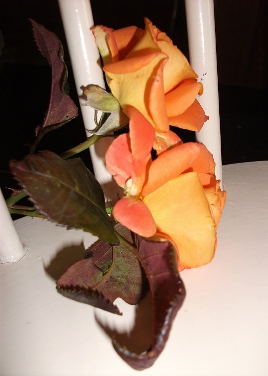
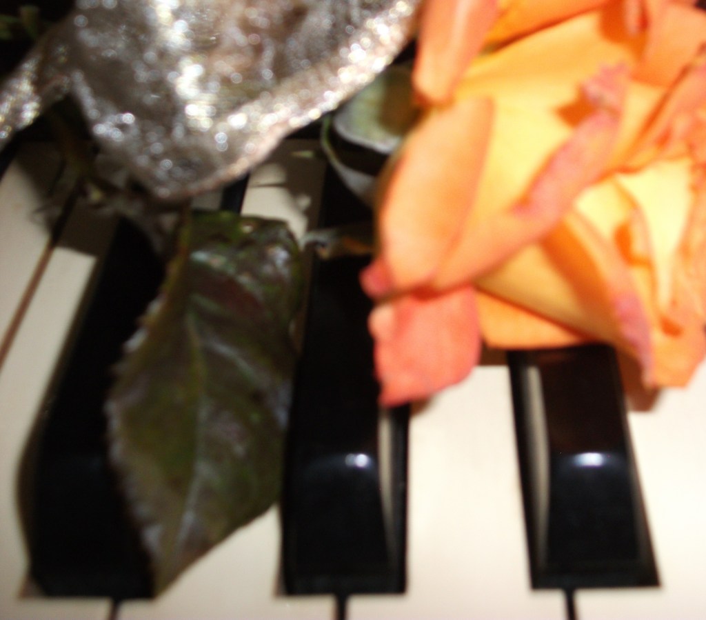
These roses for photography are from the garden, ie real “home grown” which is obvious from some of the petals. However for present purposes this does not matter – it is just about generating ideas. The next process is to try the roses on piano keys. I need to be careful though as this is specifically jazz and not any other form of music:-
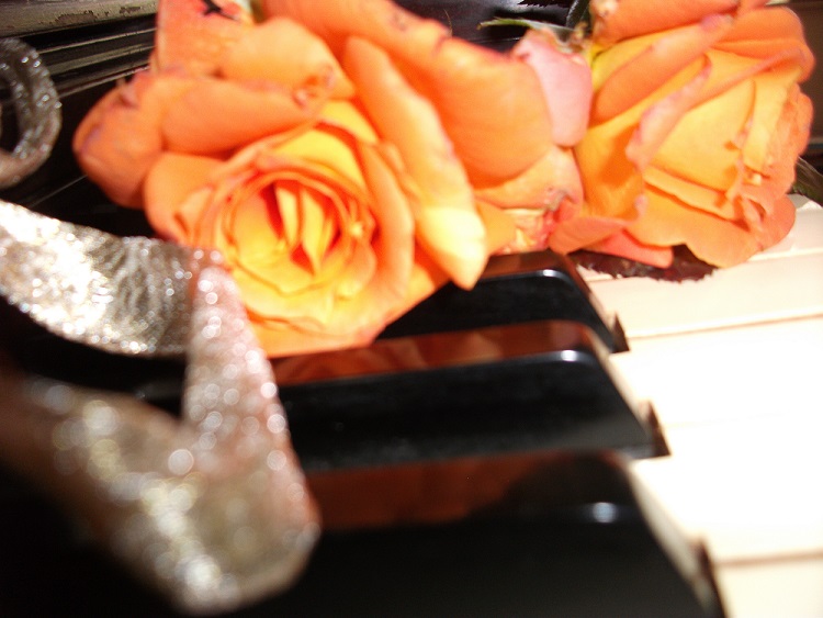
The experimentation continues:-
And at a different angle:-
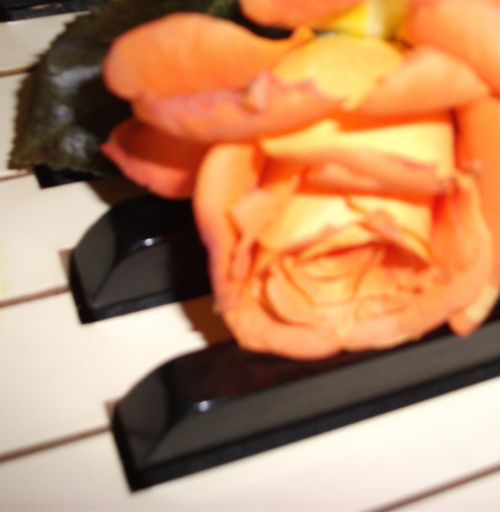
So perhaps this aspect of the rose, reflections on key board and change of lighting is a bit more jazzy and poster feeling:-
At this point I take a break to consider before returning with some thumbnails sketches:-

Whilst drawing these thumbnails I continued to think about the formal order of the black/white and yet the need for some spontaneity due to the improvisation of the jazz. When I reflect on the thumbnails I can see some of them of many be too formal. eg top right. Whilst the thumbnail in the bottom left has more vibrancy with the valve set at an angle. In doing the curve of the rose petals I found they went well with the design of a base clef.
So here is the one line visual based on the thumb nails above. I have put one of the valves at an angle to give that off-beat jazz feel and the arch and lines of the piano keys are a bit art deco as a reminder of the history of Jazz evolving through time. Space is left in two corners for text for the Jazz event details.

My second line visual has the keys facing right. I like the order of this visual :-

It would be possible to add more movement into this second visual by having the notes moving from the valves and setting the stars less in line. However I shall probably use the first visual as looking at it almost requests those valves be pressed down to make a sound. The keys could be drawn on the first design going horizontal as in this second visual. However thinking about it, it would not go in flow with the valves and they would look as though they were popping up behind the key board. In that sense the first visual is better because the edges of the valves are aligned with the piano keys so I decide to go with the first visual. However another visual explores a landscape version which shortens the valves and gives the design more strength and impact:-

The above is a draft visual. Some of the lines need leveling so they stay at the right distance rather than beginning to converge.
I now work with colour, and collage the design in the same way as the Black & White project in Part one of the course. This creates the colour visual and semi-completes the poster at the same time:-

There are spaces left for title/text. Some of the paper shapes don’t quite fit over the “keys” so these will need some working on. There are also pencil marks around the valves, so it requires adjustment. The reader might not understand that the lower part of the valves are the piano keys, however the shapes provide a dance feel and pattern to the poster. It almost looks as though the tubes are dressed up
The poster is photocopied in blue (ie moody blues and blue night for the evening) :-

Sometimes you do see the same poster re-printed in different tones.
I like the blue however decide to go the yellow and orange as this is in keeping with colours on the mood board and has more “zang”.
The doily is added for a party feeling. It might be nice to colour the bow tie to match the orange rose. I have painted areas however the paint does not hold well on the black photocopied paper, so now I shall work on the computer to finish the poster.

Here is the completed poster for Assignment Three: –
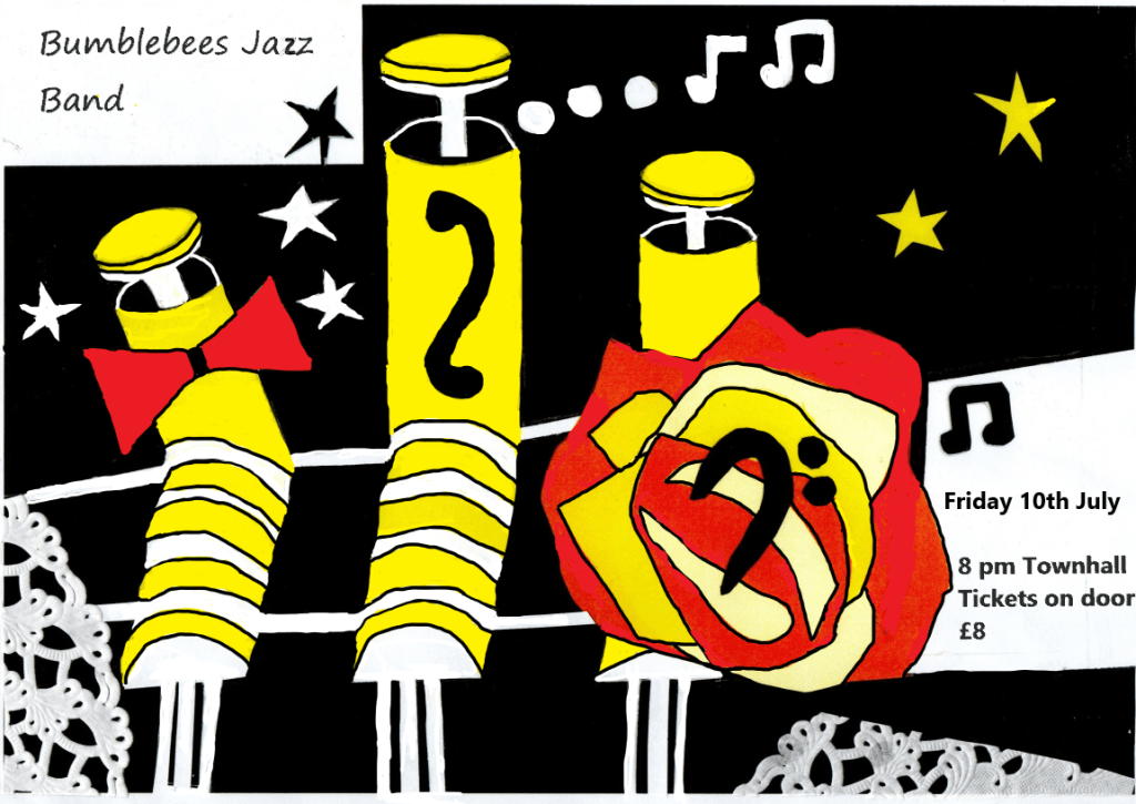
It just has to be called Bumblebees Jazz band with the stripes on the kieys ! It is a poster aimed to reflect the smart dress and musical talent yet also off beat and quirky full of fun and vibrant.
I have enjoyed working on this third assignment poster and feel it has much more of an edge over the posters completed in coursework two. i am becoming more confident on making changes to designs on the computer. It also feels good to have made progress and reached this part of the course.
References: Scott Joplin Piano Rags, Book one, Novello Publishing Ltd. London ( 1974)
Classic Rock Magazine (Special Collector’s Edition) Issue 277, June 2020)
Uncut – The Ultimate Review (6 page special) August 2020
