The aim is to produce a line visual around one of these words:-
Sea Extra-ordinary Building Journey
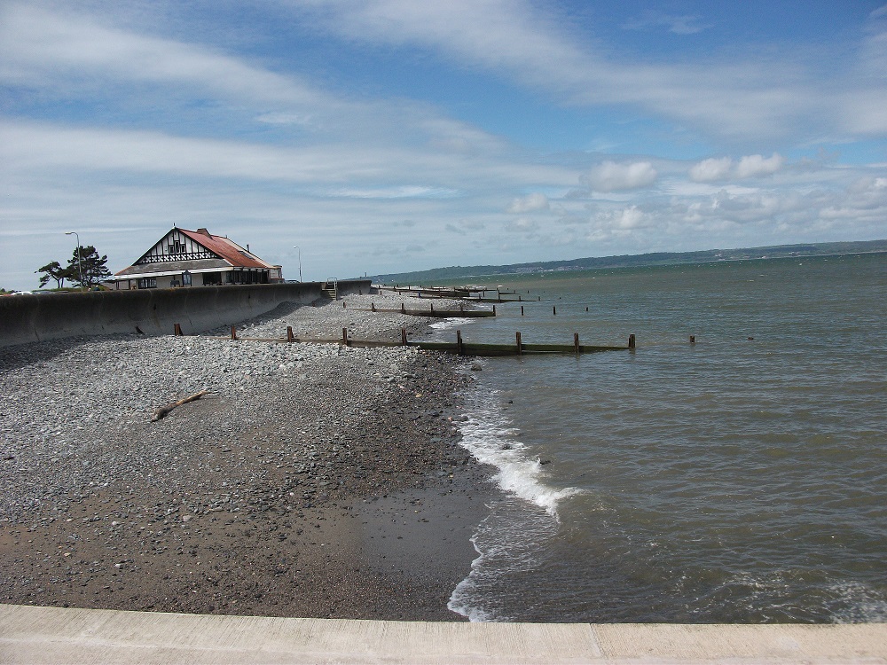
Leafing through photograph albums seems a good place to start and here there is a photograph taken from a holiday near Penmaenmawr, Wales. Working from this photograph to produce the line visual will be a good way to enjoy precious memories. So the chosen word is “sea”.
As in the previous exercise (a subjective drawing) it seems appropriate to follow the instructions step by step. So a line drawing in rotary pen is the next stage :-

This really shows the perspective and a seagull adds emphasis just above the vanishing point.
However it is too detailed to cut out shapes from. So the image is simplified further:-

The image is then photocopied inversely so the white areas become black and visa versa:-

This is much simpler and the shapes can easily be cut out to apply to the white copy.
I become engrossed in using blue tack as advised to slot the shapes in place. I add more clouds and waves. Then take time to fashion out strips of paper to reapply the beach breaks and wooden stumps out in the shore line. The stumps are difficult to size and shape correctly because they are so small.

This could be the finished result. I can see areas where the ends of the lines could be refined so the joins are smoother. However I am more interested in the process than accuracy for this exercise and experiment by a further inverse of the image via a photocopy:-

It gives the impression of a snowy winter scene or could be interpreted as a very bright sunny day.
I continue the experimentation adding white “pool” shapes to the shingle area and more waves in the sea:-

It is interesting to see how the picture keeps evolving. I wonder how I can make the beach breaks dark yet maintain the basis of the above design, while keeping within the cut and paste process. This is possible by selecting the squared area of all the beach breaks in an image where they are black and then tacking it over the same area in the image above.

I feel this black and white concept is particularly striking and it is enjoyable experimenting and being surprised by the differences in the inverse effects.
I like the idea of the shingled pools in the fore ground also taking the form of boat shapes. I could continue experimenting however there comes a point where the photocopies would gradually become less distinct without adding pen or tipex lines to tidy up the detail. For instance specks of black are beginning to appear in the white areas and the black sea stumps are becoming misaligned slightly from the ones on the land. For this exercise I want to keep in the clear boundary of adding black and white shapes more akin to collage work. This has been about experimentation as opposed to a final result.
In developing this type of work I find there are moments where it is necessary to pause and step back as sometimes it is as though you are required to think inside out and occasionally can become confused by the lines and inverse imagery. However eventually by following the process it provides a clear and patterned interpretation of the original photograph and a lovely memory of a summer holiday.
This poem by Emily Dickinson seems appropriate to include here (a 1950’s poem!) :-

Graphic artists are defined as fine artists working in a graphic or digital medium. Graphic illustration is similar to a graphic designer. These professionals create illustrations and visual concepts through the use of computer software or by hand. They develop logos or visual images that help their clients communicate their intended message.
I decide to research Andy Warhol (1928 – 1987) as graphic image maker and find an article “Lessons from Andy Warhol” in The Artists & Illustrators magazine of April 2020.
In summary Andy Warhol was born in Pittsburgh in 1928. As a skilled draughtsman he worked as commercial illustrator. Apparently he often used tracing paper to repeat images from photographs. His silkscreen canvases featured repeated images of everyday subjects, “My fascination with letting images repeat,” he said, “manifests my belief that we spend much of our lives seeing without observing.”
Andy Warhol, Green Coca-Cola Bottles 1962, acrylic, screenprint and pencil on canvas :-

The article comments “While the use of food stuffs as a meaningful subject in art dates back to the Dutch Golden Age, painters of the 17th century, Warhol was one of the first to champion the commercial packaging found in 20th century supermarkets. “.
This fits in nicely with this part of the OCA course as Assignment 2 is creating a point of sale display for a supermarket.
The article continues “photography was central to Andy Warhol’s practice. He used it extensively, whether appropriating images from magazines for his screenprints of making portraits of people around him in his Factory.
I believe Andy Warhol would have embraced the use of photoshop if it had been available in his lifetime.
Andy Warhol, Flowers, 1964 offset lithograph.

The article offers some advice: “1964’s Flowers is one composition, borrowed from a magazine photo of hibiscus blossoms, that Warhol reworked in a number of colourways. Of course, screen printing is a process that allows an artist to test combinations rather more quickly, yet artists working in other mediums can get around this.
If you are working in other media, it is still possible. Make a thumbnail sketch of a subject and make copies of it either with a photocopier or simply drawing it out several times. Test different schemes on each copy before you begin a final work.
I consider that the above advice relates to the exercise in black and white where I was able to photocopy and reproduce slightly different versions of the same scene, so it gives an insight into how graphic artists may work.
References: Artist & Illustrators Magazine (April 2020). The Chelsea Magazine Company Ltd.
Further information (following coursework two completion):-

I really like this design of these Horses of Wiltshire , Vale of Pewsey, completed in black and white imagery. It is work by Angela Shaw . Angela gave a presentation of her work at the Gatekeepers Trust Conference in 2019.
It was a gentle and thoughtful presentation of Angela’s pilgrimage visiting the ancient sites of the while horses. Angela brought to attention that all the white horses face left, only the Uffington White Horse (known oldest) and Devizes millenium ( most recent 2000) horses face to the right.
Animal trails are very popular these days: yet we see from the White Horse Trail that this connection with the landscape has taken place throughout the centuries:-
Uffington White Horse (Bronze Age), Westbury/Bratton White Horse (1778), Marlborough White Horse (1804), Alton Barnes White Horse (1812), Hackpen White Horse (1838), Broad Town White Horse (1864), Pewsey White Horse (1937), Devizes White Horse (2000).
Angela Shaw (MA, Art & Environment Falmouth) is an artist who works in collaboration with nature and subtle energies, connecting people to place through community and collaborative projects. These have included a 12 mile light sculpture in the land around St Michael’s Mount in Cornwall and a collective exhibition in Guildford Cathedral.
Reference: Gate Keepers Trust, and http://www.angelashaw.org
