From OCA course book: Subjective is based on or influenced by personal feelings, tastes or opinions.
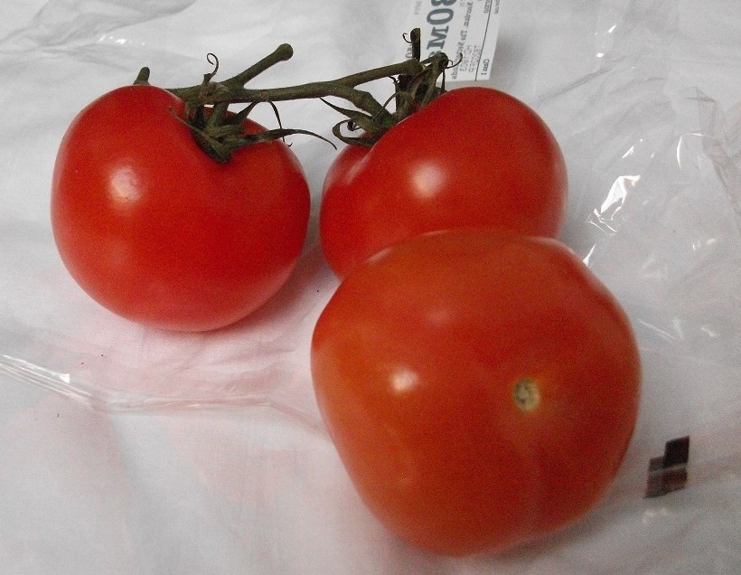
I read through the processes to produce a subjective drawing several times as at first I cannot quite understand the concept totally. So I follow through each sentence slowly. It says “take an object”. The fridge and larder becomes my practical type “spider brain storming” as I search through the contents. There is a wonderful pineapple and this would give great texture. However in the end I choose the complete opposite: smooth tomatoes. Now the courseworks says “write a list of words describing its qualities”:
Smooth
Shiny
Round
Squashy
Lustrous
Juicy
Red/green
Sumptuous
Gleaming
Polished
I debate between shiny and lustrous. Shiny only seems to define parts of the tomatoes whereas lustrous is more holistic a description. So lustrous is the defining word.
The next stage is to create a mood board based on the visual qualities:-
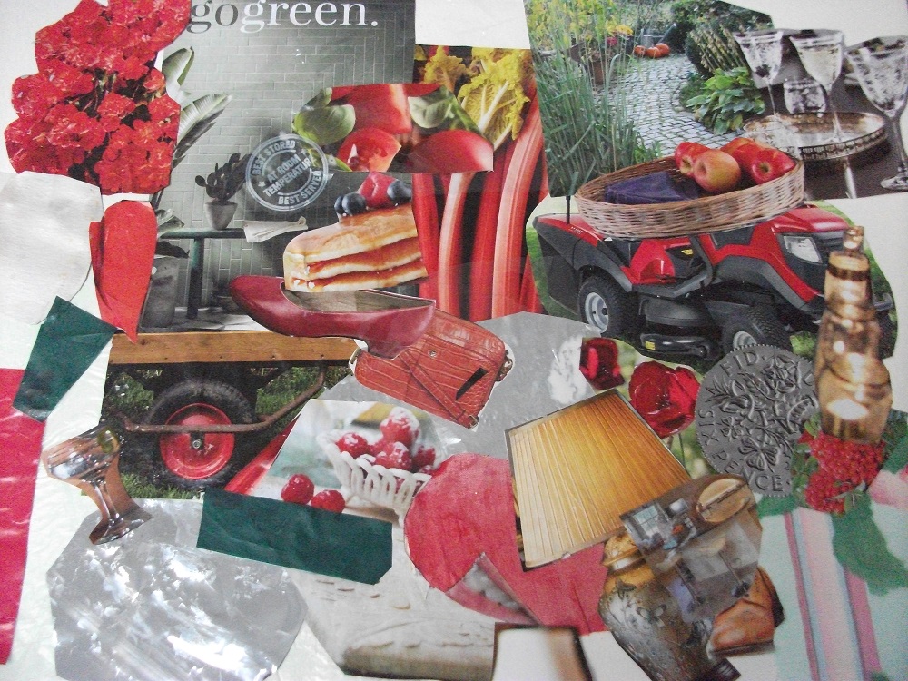
The mood board comprises the lustrous red and green colours of the tomatoes, incorporating something of the outdoors – flowers, lawn mowers, rhubarb, and the lustrous shine with lamps, silver paper, glasses, cellophane, silk and a silver sixpence.
Next is a line drawing of these lovely tomatoes on the vine:-

Then the instruction is to use colours, textures and materials identified during the experiment with the mood board.
On examining the mood board I review that the red flowers, silk and foil paper most reflect the word lustrous for the tomatoes.
I find some baking paper and place it upon a layer of tin foil. It feels apt to use these cooking materials relating to tomatoes as source of food. The baking paper over tin foil provides a tonal impression of the fruity inner of a tomato, a sort of orange background on which to trace the line drawing.
I then set about filling in the tomatoes with collage. Each tomato is made up mainly of different material ie, paper flowers, foil, silk material. The shading and highlights are then added to the tomatoes with foil and paper. The vine stems and shade are completed with green package paper which the tomatoes were originally wrapped in.
To finish the drawing to add the lustrous shine I cover each tomato with cellophane.

The result is really pleasing. By taking this exercise step by step I am glad to have achieved this outcome. If I had tackled this as a whole I would not have been able to produce this however now I comprehend the reason and purposes of the mood board and how by examining the nature of subject, it is possible to create an image that speaks of it’s qualities.
The scanned image above does not quite do justice in distinguishing between the fabrics used. I did have some difficulties in sizing and shaping the silver outlines and perhaps would have liked to have been able to shape them more delicately in places. Some detail tended to be lost especially in the outline of the vine.
As a further critique of the work I realise I have not considered perspective ie I could have experimented more with placing the lighter silk on one of the tomatoes at the back and making the front tomato much larger in size.
However I like this drawing and the feel of the finished article.
Research re: Cezanne (following coursework two completion):-
Paul Cezanne (1839 – 1906)
Cezanne as an artist experimented on the cusp of objective/subjective art. Although Cezanne took part in Impressionist exhibitions, he spent most of his time in his native town of Aix, where he tackled the problems of his art. Outwardly he lived a tranquil life, however he was held in a passionate struggle of artistic perfection in his work.
Here are some of the areas of artistic conflict he encountered:-
He appreciated the balance and perfection of the classical masters and aspired to capture this serenity too, however he wished to look at objects anew with the impression of space and solidity, rather then through traditional rules.
He admired the new discoveries of colour and modelling eg the dissolution of firm outines to flickering light and coloured shadows, yet he still wanted to portray the sense of clarity and order of the old masters.
Cezanne did not like messiness. Impressionism tended to be brilliant but messy. But Cezanne did not want to return to academic conventions of drawing and shading solidity or to return to “composed” landscapes for harmonious design.
He wanted strong, intense colour. The Impressionists had started to apply colours direct to the canvas rather than palette mixing providing much brighter pictures. However this flat patterning lost some of the depth and reality that Cezanne wished to convey from the merging in tones of nature.
So he stuggled in experimentation with “Impressionism into something more solid and enduring like the art of the museum”.
Did he achieve a sense of order and repose yet not imposed on nature’s natural harmony?
He was interested in achieving balanced design with a sense of depth and no loss of colour in an orderly arrangement. He did not mind if there was some loss of detail in the process however this was not the purposely intended. He found he could convey depth and solidity without conventional draughtsmanship.
Here is a postcard of Cezanne’s work entitled: Blue vase, The colours are vivid, the vase, dish and fruit appear solid and there is some depth in the flowers, and windowsill. Yet there is an impressionist element in the brushwork.

When Cezanne painted a still life, he explored the relationship of form and colours within only so much “correct perspective” necessary for his particular experiment.
Before studying the subjective and objective exercises, I would not have appreciated this research on Cezanne. Now with a greater understanding of objective realism and the subjective feeling, I can glimpse something of the different approaches that Cezanne was working with and his efforts in finding his own pathway through them.
Reference: Gombrich, E,H, The Story of Art, Phaidon Press Ltd. London.
