This assignment is an opportunity to consolidate the understanding acquired throughout the course, to reflect on the enjoyable aspects of the work and be free to create certain parts of the brief allowing maximum capacity for personal interest.
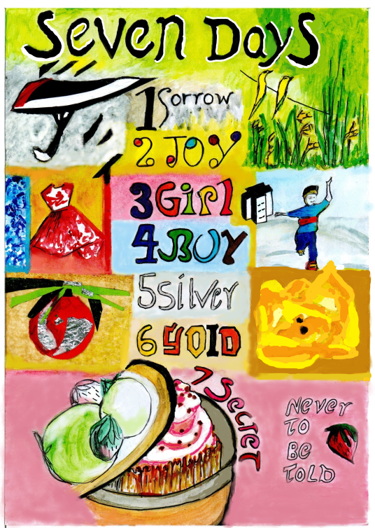
The brief title is Seven days.
The interpretation of these days can be objective or subjective. They can be shown as separate identities, one large diagrammatic or as a continuous strip. There is choice in terms of media, style and content (magazine, newspaper, book, brochure, poster) and the intended audience.
Firstly starting with generating ideas – a spider diagram:-

From the spider diagram I am choosing the well-known counting song “One for Sorrow, Two for Joy ..”
From google – “The earliest version of the rhyme was recorded in 1780 in a note in John Brand’s Observations on Popular Antiquities. John Brand was an English antiquarian and Church of England clergyman who was appointed Secretary to the Society of Antiquaries of London in 1784”
Here is the counting song :-
One for sorrow,
Two for joy,
Three for a girl,
Four for a boy,
Five for silver,
Six for gold,
Seven for a secret,
Never to be told!
The rhyme can continue to 8 and beyond however most of us are just familiar with the first 7.
So the brief is:-
- To produce an A4 design proportional to generating a poster/tea-towel.
- Images to appeal to a family household
- To be based on the counting rhyme “one for sorrow etc.” through to number 7 maximum
- The numbers to be shown as digits in the design (ie not written as words) except for the heading.
- To use a combination of the OCA exercise work as a celebration of the studies
- Varied use of media and include both objective and subjective example
I am hoping this will be an opportunity to re-visit the cup-cake and present it as half-hidden in the drawer as OCA feedback suggested.
A mood board is made to help focus on the criteria where elements linking to previous coursework can be incorporated:-
eg.
1 .(Sorrow) New subject yet to interpret in an exercise.
2 – (Joy) Beethoven Ode to Joy ( Abstract Illustration ) & Daffodils (exploring drawing & painting)
3 – (Girl) 1950’s lady (Using Reference exercise)
4. (Boy) Boy in hierarchy exercise enjoying the outside space (Illustrating visual space)
5. (Silver) Silver in subjective drawing (when I used silver foil for light on tomatoes)
6. (Gold) Outline of orange/gold rose from Assignment three (Jazz poster)
7. (Secret) Secret cake in drawer. (Magazine illustration)

Working on the thumb nails next the idea is to have the pictures merging into the background rather than depicted individual squares, so after initially starting with straight edged thumbnails I made them more oval:-

At this stage I have yet to decide on the lettering and numbering. Do I include the whole rhyme. Do I include numbering at all.

I am deciding to place the “secret” cake half hidden in a tin rather than a drawer this time. And wonder if the drawings will speak for themselves and require less wording & numbering especially as the verse is so well known. I sketch as I think about this:-

May be the wording can be changed to “And 7, a secret never to be told” or “with a Secret never to be told” or “Here’s 7, a secret never to be told” and place the hidden cake in the middle of the images.
I work with the line visuals to resolve some of the questions the thumbnails have led to.
Then start on the poster/tea-towel, plotting out areas for the text and images:-
Collage and paint seems to work well together for texture. So I decide to include cut-out card and papers in the rest of the design where I can.

The background to the umbrella is too dark and this will need to be altered.
Then a tomato with silver from the light and gold rose. The tomato looks a little like a bauble however I do not think this matters. It can be left to interpretation. It is the light as silver on it which is of relevance. I need to be aware of not compromising on proportion in order to fit the images into the spaces allotted :-

It is also necessary to consider how the text will look and choose between different typeface. I experiment on the computer first:-

So the design is now beginning to take form. The names and numbers are now down the centre of the poster so individuals can be left to discover for themselves which image relates to each number.. I am working on A3 paper:-

And the cake is hidden in the tin for the number 7 secret however I am wondering whether to write the “secret never to be told” as an arc over the top of the cake so the numbering is more in sequence:-

So placing the lettering in sequence allows better use of the space and makes for more interest :-

The next step is to colour in the lettering using rotary and felt tip pens. The lettering in black for “Seven Days” may need cheering up with a bright background. It is proving quite a process and I always expect to have done more in the time available ! an A4 scanner is being used to upload this work however it is possible to provide a idea of how the poster currently looks –


I might block in the lettering “Never to be told” so long as it does not “compete” too much which the heading. I wonder if I can do the “5 for Silver” in open lettering instead as I feel it may be getting lost amongst the rest of the lettering.
A lot of the preparatory work is now complete and I am looking forward to painting the imagery with the purpose of bringing it together into one coherent piece.
So with paint added (both watercolour and acrylics). It still needs some work however it feels it is beginning to integrate better and also has some texture which adds a element of depth. :-


After further work in ink and felt tip here is the draft A3 downsized and scanned into the computer as A4 as a tonal version. You can see where I unfortunately spilt some water during the earlier watercolour painting on the ys of Days ! However such processes are a learning experience in working out during painting how not to carry a wet brush above areas of work and to watch you do not lean on work either. By the time I noted this blob of water it had soaked in too well to be lifted off with tissue paper :-


Generally it feels good to see how bright and colourful the overall image is. I’ve doubled up over the word silver to make it more equally obvious amongst the rest of the text.
Perhaps the text could be more evenly aligned and sized however I rather like the “home-made” look which the slight of-line achieves. It allows for flexibility and interest without being so off-centre to be annoying to the eye .
Here is the final poster for Assignment Five ! – The Title has been highlighted in white shading to lighten it and the whole poster is a celebration of the OCA coursework for Key Steps In Illustration.