The brief : A magazine wants an illustration on a topic (chosen: Guilty Secret). The illustration is to be based on still life.
So starting with a spider diagram and making the decision to invert the black and white imagery to set the atmospheric background of a hidden secret :-

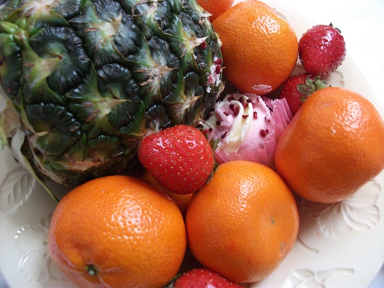
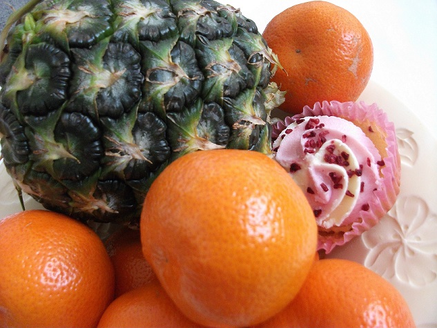
After this serious spider web, I try to think of what the guilty secret might be. I think along the lines of secret hidden holiday destinations however nothing really guilty if people want somewhere quiet, then secret surprises eg birthdays or celebrations but why would they be guilty. Eventually I choose to think in a more light hearted way to something most can relate to & which often appears in magazines these days – the good health diet, but is that a cake lurking amongst the fruit ?
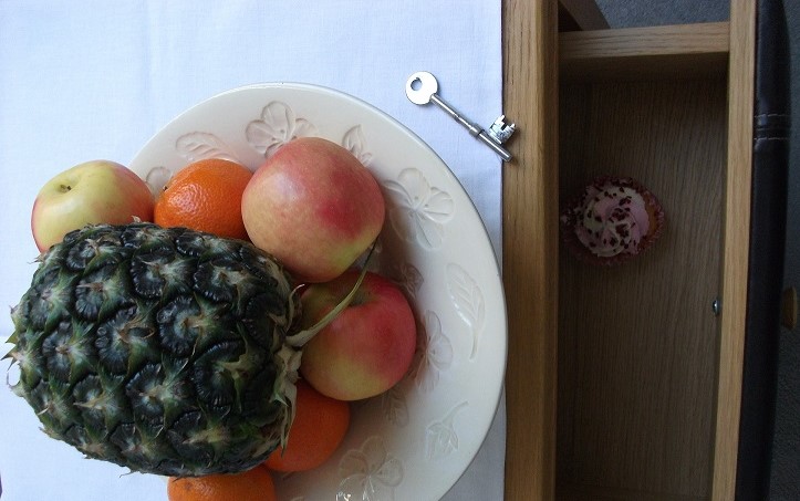
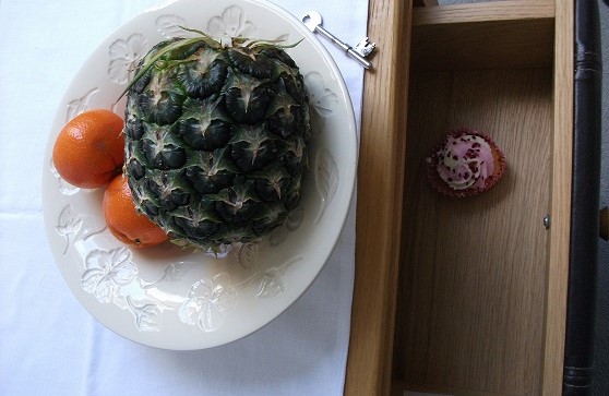
or hidden in the drawer (this does refer back to the idea in the spider diagram by use of keys, locks, drawers etc.):-
The next step if to explore composition with thumbnail sketches:-

It is proving more difficult to draw the cake in the drawer. I know I could produce a reasonable outcome from the middle lower thumbnail with just the cupcake beneath the fruit all piled up above, however I am also mindful of the brief of a guilty secret and including the key and drawer seems closer to meeting the requirements of the brief so I keep trying:-


Then the tonal drawing as advised and this helps in producing a bolder drawing and allowing for distortion of the image as this cupcake is really too tall for the drawer depth :-

And then a client line drawing. The line visuals are good discipline in ensuring accuracy of line. I am struggling with the perspective of the drawer and can see that the lengths (top and bottom) are not quite the same. I have removed the pineapple as it seemed to be competing in terms of hierarchy with the cake. :-

A further line drawing with improved perspective:-

Now I take a break and return to this the next day. I can now see where the perspective in the line drawing is at fault. The drawer lines need to go closer together into the distance whereas I have drawn them becoming closer nearer to. This can be corrected in the final painting:-

I have had doubts tackling this assignment and it is a relief to have persevered and the result is an improvement to how I imagined it would be. I left the fruit free on the side rather than in a dish. The first strawberry does appear to be floating rather than on the surface though. I wanted to keep the colours fairly fresh as sometimes I over paint. In terms of hierarchy, the large orange may be competing with the cake however overall the white of the cake brings the eye’s attention. The black of the drawer adds to the idea of hidden secret.
Since this part of the course is about style. I am also going to experiment with depicting the design in the stripes as an echo of Dani Gerraton’s work again.

This places the cake more in the centre in comparison to the fruit and the bold red line helps to highlight the key. It also gives the cake a three dimensional feel. It may not be as clear in this picture that the cake is in a drawer however the literature in the magazine would explain this to a reader and they would be able to read this image as intended. I am pleased with the outcome here as I like the band of colours for the theme (brown, orange, crimson and red). I was going to leave the fruit unpainted however the light green of the apple is a complete contrast indicating its difference to the cake. I like the texture of the paint in the brown and orange which reflects something of the grain of wood in the drawer and the spongy nature of the cake.
