The purpose of this exercise it to produce an illustration for a menu card of a sophisticated quality fish restaurant – modern, bright and contemporary in design. The image is also to be intended as a logo so it needs to be straight forward and clear. An example of the logo needs to be 40 x 40 mm.
Instead of “brainstorming” with a spider diagram I am deciding to photograph fish imagery from plates, tiles, cups, coasters, just to get a feel for the subject matter.
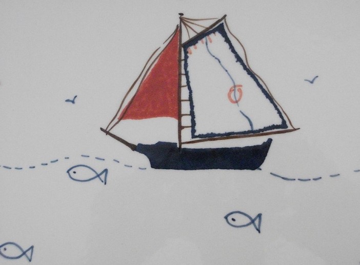
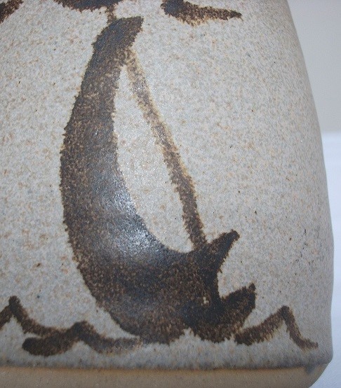
Design found on a porcelain plate:-
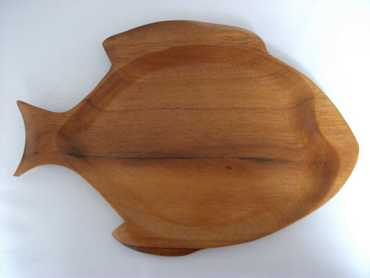
Wooden fish platter:-
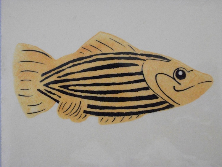
Striped fish on coaster:-
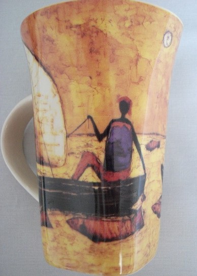
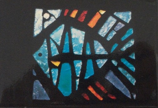
Fishing on a cup:-
Fridge magnet :-
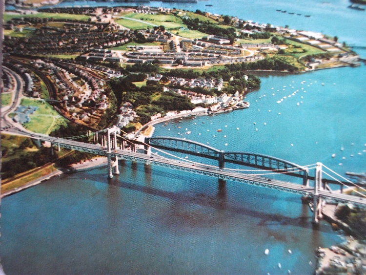
Coaster of sea bridges :-
This is helping to get a feel of the sea, vessels, fishing and restaurants, although eating out is a different experience in a pandemic as shown on a BBC webpage:-

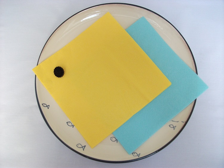
So considering how a customer may prefer a particular restaurant it may be the atmosphere, the decor, the seating ie not just the food, however the first impressions of the tables, seating and the anticipation of the meal, the cloths and the napkins are just as important:-
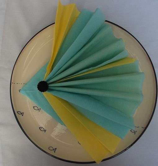
I collect some paper napkins and follow the instructions on You Tube to come up with some simple fish designs:-
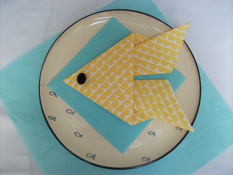
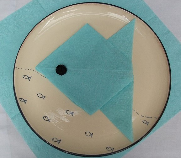
I quite like the idea of using a napkin design in the logo in some way or to indicate a napkin so the logo relates to a restaurant. I fold the paper to see if I can make a fish tail to be incorporated to give a three dimensional effect :-
I now have sufficient resource material to work with and set to with some thumbnail sketches. During the process of sketching the fishes eyes develop into bubbles:-

I like the body of the fish being square. It helps to provide a clear geometric shape in keeping with the brief to design a crisp contemporary image. I work out the corners of the squares and the angle of the tail which I hope will appear to be coming forward out of the “square” fish to add an element of dynamism. I need the outer tail colours to contrast with the colour of the fish and then a single opposite colour in line with the fish eyes so I take time to accurately plot it out:-

Working with these basics I settle on three fish eyes, thus distorting the image however it is still identifiable. The fish eyes then transform into bubbles. The colours are two toned to keep it simple. The design colour is interchangeable – you could have a yellow fish and blue fan tail or other dual colours could be used. The tail could be drawn smaller in scale to the fish. More bubbles could be added or coloured completely blue.
ie there are choices that a restaurant might wish to explore within the design to fit with their particular furnishings. So I feel it is important to be aware of the flexibility that can be worked with and offer a logo that is open to some adaptation if necessary:-

So in summary the logo above is for a fish restaurant intended to be a clean image, bright and contemporary in design. There is some element of adaptability in the logo in terms of colour and ratio of size of tail relative to fish. The stripes in the tail relate back to the napkins as a link to a restaurant and the patterns that occur on a fish. Using a square to represent the fish plate rather than a circle provides the contemporary feel. The tail could be angled further and the blue flattened edge used to write a message or words can be included in between the stripes.
Here are some examples completed on the computer ‘Paint’ programme as a variation on the main logo:-


Or an even brighter logo:-

Through experimentation a clearer tail pattern has emerged with two white stripes joined and one middle individual one. I like this tail version as it appears more solid and well defined:-

