For this exercise the theme Summertime is being chosen as it is June 2020 when I reach this stage of the course. Using a digital camera to zoom into a selection of summery items: sunglasses, fliplops, beads, shells and a bright flowery jug the following photographs are taken:-
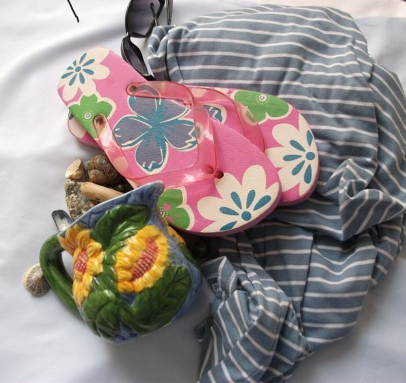
View from above showing all the articles for this exercise:-
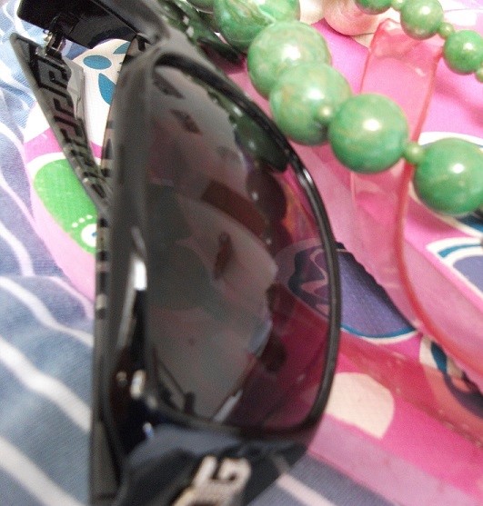
Closer view of the glasses & beads:-
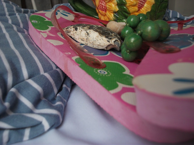
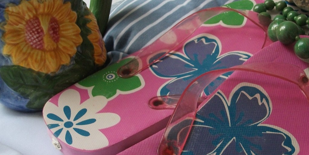
The flipflops and pottery sunflower:-

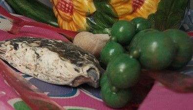
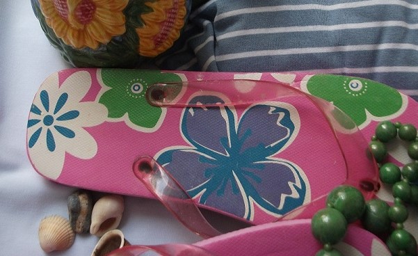
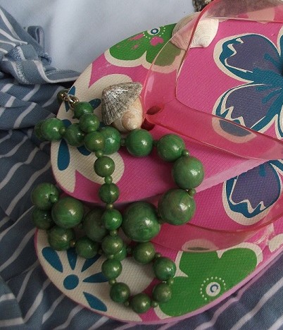
Shell & beads on angled flipflops:-
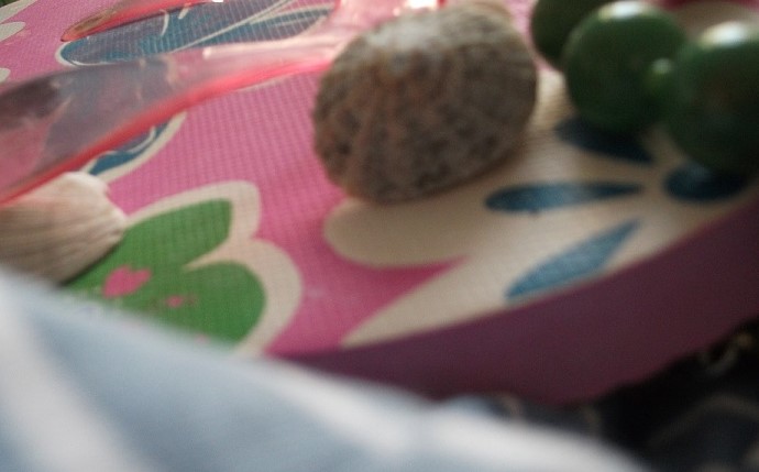
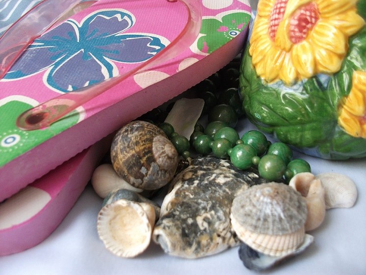
Better view of the shells. This is my favourite image so far. Seaside shells and textured sunflower and colour combinations of grey/green, yellow/green and pink/blue/green:-

Simplified view of summery image. This would make a good abstract image:-
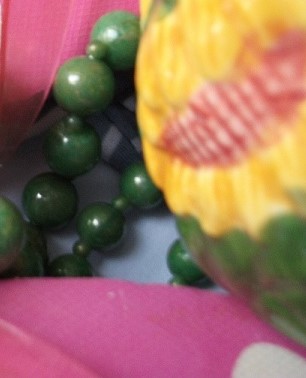
I quite like this slightly out of focus zoomed in image too:-
Another view from above:-
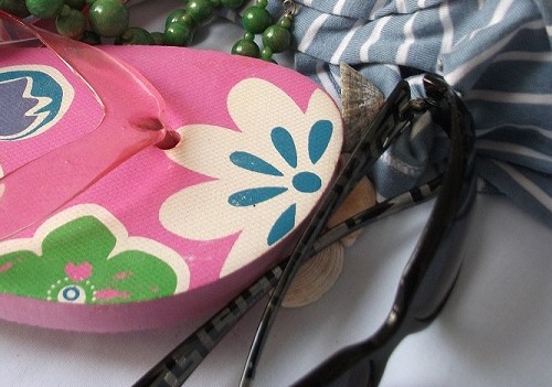
Including the sunglasses again:-
Toe piece of flip flops with beads:-
It is enjoyable to celebrate summertime in photography and exploring the subject matter from these different angles in order to focus on the content.
Following the instructions here is further exploration through thumbnail sketches. I find it helpful to lightly add colour to help in comparison with the photos when choosing a final design:-

Of the thumbnails above my preferences are for the top left and far lower right.
So for the final pencil visual I am going to work from this draft thumbnail:-

And this photograph:-
These two view points fit best with the word “summertime” as you can see the flowers on the flip flops and the yellow “sun” of the sunflowers on the jug. I have seen in the other exercises how having an angled object coming into the frame adds dynamics too. I also like the more oblong format with the sunflower jug at the top right as though it is the sun in the sky.
Changing the view points helps in deciding on the content. The glasses have been left out and so too the shells as they looked a bit “busy” and over complicate the picture. The blue and white material has evolved to give the indication of mosaic paving or even water which would not have happened without this exploration eg: you can see here :-

I have scaled the visual in keeping with the oblong thumbnail (following the instructions in the coursebook):

And here is the final pencil visual:-

The line visual is larger than shown here.. It is proportionally scaled to the thumbnail. I feel this reflects the word “summertime” and overall feel pleased with the result.
The top left is blank to allow for a Title/Text. Looking at this I hope it gives the impression of putting the flip flops on and enjoying a summers day.
