The brief: To create images which will be used within a campaign for a supermarket, to package and promote a range of seasonal foods.
The supermarket is respected for the quality of food they supply. They want to promote this notion of quality in their design and packaging.
The finished images will be a ‘point of sale’ display sited in a store near to the fruit and vegetables. The final reproduction size will be 12 x 12 inches (or in scale).
I make notes to be clear I am understanding the brief and refer to OCA guidance:
It will be necessary to consolidate the skills and knowledge gained from the projects and exercises completed so far.
The images should be objective (ie realistic, not subjective).
The aim will be to create an illustration of fruit or vegetables – one illustration for each of the ranges: Summer, Autumn. (an individual piece or group of several pieces of fruit/vegtables).
Then create separate images for Summer and Autumn that reflect both the produce selected and aspects of the season itself. – other objects can be included, a place, patterns, people or a combination of these.
So I have taken note of the brief and made sure I understand what is required. As in previous exercises I now apply the processes I have learned to generate ideas:-
I start by listing seasonal fruit and vegetables after searching the internet, cookery and gardening books. A list is sufficient as these are not ideas but rather facts about seasonal fruit and vegetables.
Examples of summer fruits: strawberries, raspberries, plums, grapes, peaches, watermelon, mango, redcurrants, cherries, blueberries.
Examples of summer vegetables: green beans, runner beans, tomatoes, peas, lettuce, radishes, spring onions.
Examples of Autumn fruits: blackberries, apples, pears, cranberries.
Examples of Autumn vegetables; leek, broccoli, pumpkins, squash, carrots, sweet potato, brussel sprouts.
The next step is to complete spider diagrams around Summer and Autumn generally.
Bright yellow paper is used for the Summer spider diagram:-

And orange paper for the Autumn spider diagram:-

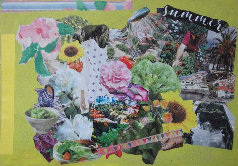
I also create a summer mood board painting it yellow before adding photos from magazines of summer fruit, vegetables, flowers, gardens, salads, glimpses of summer travel locations. I find some fabric with pale pink flowers :-
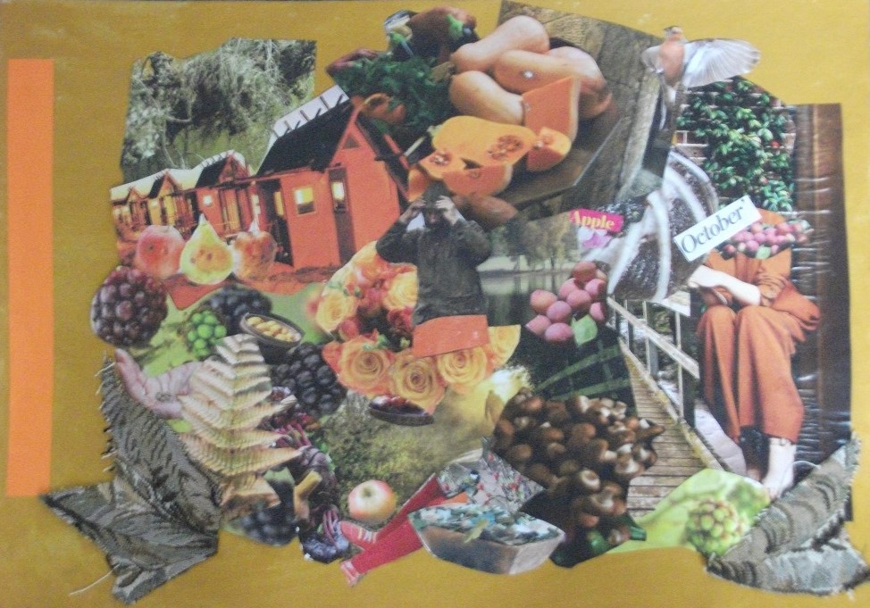
And the process is repeated for an Autumn mood board, painting it orange before selecting themes of this season. Some textured furnishing fabric is applied too:-
At this stage I have gained a feel for the Summer and Autumn seasons and now need to choose from the lists which fruit/vegetable/s to represent for each season.
The mood boards are beginning to look a bit “busy” and I think I need to refer back to the process of making of mood boards again so that by being “exhaustive” in choice and encompassing it also is representative without becoming too much.
I take a trip to the supermarket and return with grapes, peaches, a melon, bananas, tangerines, radishes. spring onions and red onions, broccoli, beans, carrots, mushrooms, potatoes.
The posters need to be in scale to 12 x 12. The scanner is 8 x 9 so 8 x 8 will be a suitable size to work with.
As a follow on from the mood board I begin to create backgrounds for the two posters. The water pool and water element seem especially welcoming within the summer mood board. For the summer poster I select an arbour of roses and mix this with a photo of cress leaves to make an arch over a sea view. A few crease lines in the papers will need to be painted over.

The first idea is to have an outdoor table with a dish of grapes and selected fruit. However the details would be small and for a poster it needs to be more eye catching. On slicing the melon it is a lovely yellow inside and this would be a complimentary colour to the blue sea. A few sketches of the melon reveal a boat shape. I trial the cut out sketches as a series of boats diminishing in size to give some depth as though in a creek or bobbing at the edge.

So I now have the basis of the poster and intend to work on the melon to add detail and ensure it appears appetising. It is also important to keep in mind that it needs to be an objective depiction as requested in the brief. The concept is the melon reducing thirst on a hot summer’s day, so the water of the sea & melon is important. I am thinking of cool tidal water, cool tide and eventually “tidal cool” would make a nice caption. It is not necessary to place the word summer as it is hopefully clearly a summer scene.
On leaving this image for a while and then returning to it, I now wonder if instead of a row of melons I could choose other fruit diminishing in size into the distance eg a peach or grapes/strawberry. However this may result in adding “warm” colours contrary to the cool theme. . So I decide to keep to the theme representing it with just one type of fruit.
A print out of copies of the scene before adding the fruit allows for some experimentation. Eventually I paint in a row of three melons with use of crayon, acrylics and ink pen.

The colours are deeper once printed. Perhaps the fruit could have been better aligned so they all angle the same. They do appear to be “floating”so to anchor them I trial some waves of cut out paper similar to the “black and white” project but with blue paper.

The blue waves bring more attention to the fruit. And because the tides are all a little different this seems to allow the fruit sections to be slightly different shapes to each other too.
I feel the main objective of the brief is met in this poster. It is definitely a summer scene and I think the fruit looks fleshy, colourful and tasty. If I were to repeat this exercise I would tilt the slices more for added interest and perhaps shape them more similarly to each other rather than how they appear in reality. The melon is drawn and painted objectively, although I do find it difficult to depict the fruit’s nature without resorting to a more stylised or subjective version.
Finally I type in words “Tidal Cool” to provide a more professional finish and lighten via the photocopy so the melon looks fresher :-

For the Autumn poster to link it with the summer one, another arbour is shown although not as complete. Autumn can sometimes be mistaken for late summer or winter, so this time the poster is headed “Autumn”. Referring to the mood board the selection of a tree and squirrel feel right. It says in the brief that other objects can be included eg. a place, patterns, people or a combination of these. A squirrel adds something that appeals to families and all age groups who would visit a supermarket shopping.
Some of the seasonal Autumnal fruits eg pumpkins are not available in the supermarket. Perhaps this is good as it means the poster will be different from the “halloween” theme.
I choose the red and yellow/orange onions. They are true root vegetables, connected so to nature. A caption could be “rooted in nature” or “pure nature”. Can I give justice to the surface shine of the onions in the design.

I add my initial sketches to the poster:-

The onions in crayon look quite good however they do not really blend in so I trial a painted version. Again print outs of the main poster background allow for experimentation.

The tone is now improved however the onions look haphazard and cluttered. Perhaps it is best to complete fewer onions.

I feel these onions look solid and wholesome and the richness of colour is certainly Autumnal. Finally again I type in the heading:-

Of the two posters I prefer this Autumn one. This is a surprise as the variety of summer images and fruits seemed to offer the opportunity of choice. However the summer fruits of strawberries, melons, peaches etc. have less structure than the Autumn seasonal vegetables. Trying to capture the sense of “cool” and the inside of a summer fruit is a challenging exercise.
Generally it is good to have followed through the processes of meeting a brief and to complete the assignment within the time frame.
Further information (following coursework two completion):-
Researching botanical artists there is an article in the Landscape magazine about Lizzie Harper who works from her garden studio on the outskirts of Hay-on-Wye, Powys. Lizzie studied natural history illustration at art school in Bournemouth. Her first degree was in zoology.
In describing her approach to her work Lizzie notes “I always begin with quick 10 to 15 minutes habit sketch. then I’ll add the venation, the main colour and finally pick out the finer details”. She uses Stonehenge Aqua Hotpress paper as it holds the colour and likes to use mechanical pencils eg Pentel 205 with an HB or H lead of 03 mm size.
Lizzie at work in her garden studio:-

A few years ago Lizzie created a set of illustrations for the Wildfowl and Wetland Trust. Her recent publications include ID guides for the Field Studies Council and books: Teh Hedgerow Handbook, Collins Flower Guide and The Bumper Book of Nature.
The first step Lizzie takes for any illustration is research, eg trying to find the plant in the wild and making a very basic annotated sketch, and taking some photos on a phone as a record. Google reference books and social media also help.
Lizzie’s botanical illustrations range from entire trees to individual leaves, and from flowers to fungi. But she also paints insects, birds, amphibians and mammals in careful detail.
As an initial sketch Lizzie uses watercolours, first picking out the darkest greens before layering concentric circles in increasingly lighter greens. Her brushes are replaced every month as they wear down over time. She often works on two or three projects eg while waiting for a layer to dry, she might begin the drawing stage for another specimen, share photos of her work on social media or scan a finished artwork.
Using a colour chart guide, Lizzie builds up different tones of green on her leaf:-

In her spare time Lizzie is interested in illustrating a map of plants she has drawn over the years. “I now know where so many wild flowers can be found, both locally and around the UK.” and she would like to share this information with others.
Here is one of Lizzie’s completed field scene illustrations:-

Reference: Landscape Magazine June 2020
.
